Wildfire maps are now a daily awareness tool for people living in fire-prone regions—but access alone doesn’t guarantee understanding. Different wildfire maps show different data, update on different schedules, and have real accuracy limits. This guide explains which wildfire maps are most useful, what their layers actually mean, where blind spots exist, and how to turn map awareness into safer, earlier decisions. Wildfire maps support readiness and evacuation planning—but they should never delay action when conditions change quickly.
In Short
Wildfire maps are powerful tools for awareness and preparation, but no single map can show everything that matters in a fast-moving fire situation. This article breaks down which wildfire maps are most reliable, how to interpret key layers like fire perimeters, satellite heat detections, and smoke, and where common accuracy gaps or delays can occur. It also explains how to combine fire maps with smoke and risk data to move from passive monitoring to active readiness—always emphasizing early action and evacuation as the safest response.
Contents
- Where to Start: The Core Wildfire Map Stack
- How to Read a Wildfire Map (Without Misinterpreting It)
- Accuracy Limits & Blind Spots You Need to Understand
- Pairing a Wildfire Map with Smoke & Air Quality Data
- Using Wildfire Risk Maps for Context (Not Prediction)
- World Wildfire Map, US Wildfire Map & Live Satellite Fire Map
- When to Act: Turning Map Awareness into Real-World Decisions
- Last-Resort Safety: Where a FORT™ Fits in a Layered Plan
- Frequently Asked Questions
- Key Takeaways
- Conclusion
Where to Start: The Core Wildfire Map Stack
Where to start with wildfire maps can feel overwhelming, especially during active fire conditions when information comes from many sources at once. No single wildfire map provides a complete or perfectly current picture, since fires move quickly and data updates on different schedules. The safest approach is to rely on a core “map stack” that combines multiple tools, each with a specific role. Regional maps help identify emerging fire activity and smoke trends, national maps provide verified incident information and confirmed perimeters, and public-facing apps surface alerts and evacuation updates. Used together, this layered approach reduces blind spots, avoids false reassurance, and supports earlier, safer decisions.
Global Wildfire Maps
Global wildfire maps provide wide-area situational awareness, helping users see where fires are active across continents and how smoke is moving over long distances. These tools rely primarily on satellite sensors and are best suited for trend monitoring, early awareness, and retrospective analysis—not neighborhood-level decision-making.
Key global resources include the NASA FIRMS Global Fire Map, which offers near real-time active fire “hotspot” detections from MODIS and VIIRS satellites along with burned-area layers and GIS downloads; the NOAA Hazard Mapping System (HMS), which provides analyst-curated fire points and smoke plume interpretation across the Western Hemisphere; and USGS / Landsat wildfire products, which are best for mapping burn scars and fire extent after events rather than tracking live fire behavior.
United States National Maps
United States national wildfire maps narrow the view from global trends to verified, incident-level information across the country. These maps prioritize accuracy and coordination between agencies, which means they may update more slowly than raw satellite feeds, but the information they show is confirmed and dependable. They are especially valuable during complex fire seasons involving multiple states or regions, when understanding the broader national picture helps explain rapidly changing conditions.
The central federal hub for this information is the National Interagency Fire Center (NIFC), which publishes current large fire locations, official fire perimeters, historical fire data, and links to other federal datasets. NASA FIRMS U.S./Canada also provides a regional satellite-based portal to support faster awareness across North America. For interactive visualization, Esri’s Wildfire Activity Map / Wildfire Aware brings together perimeters, hotspots, smoke, and alerts into a single situational-awareness view that is easier for the public to interpret.
Public-Facing Apps & Alert Services
Some wildfire tools are built specifically for public use, prioritizing clarity and speed. These platforms blend satellite detections, official sources, and human review to make wildfire information easier to interpret.
Watch Duty is a public service covering the United States that aggregates satellite data, official incident reports, aviation tracking, and human curation to display active fires, evacuation zones, and alerts. As with all apps, it should be used alongside official emergency notifications.
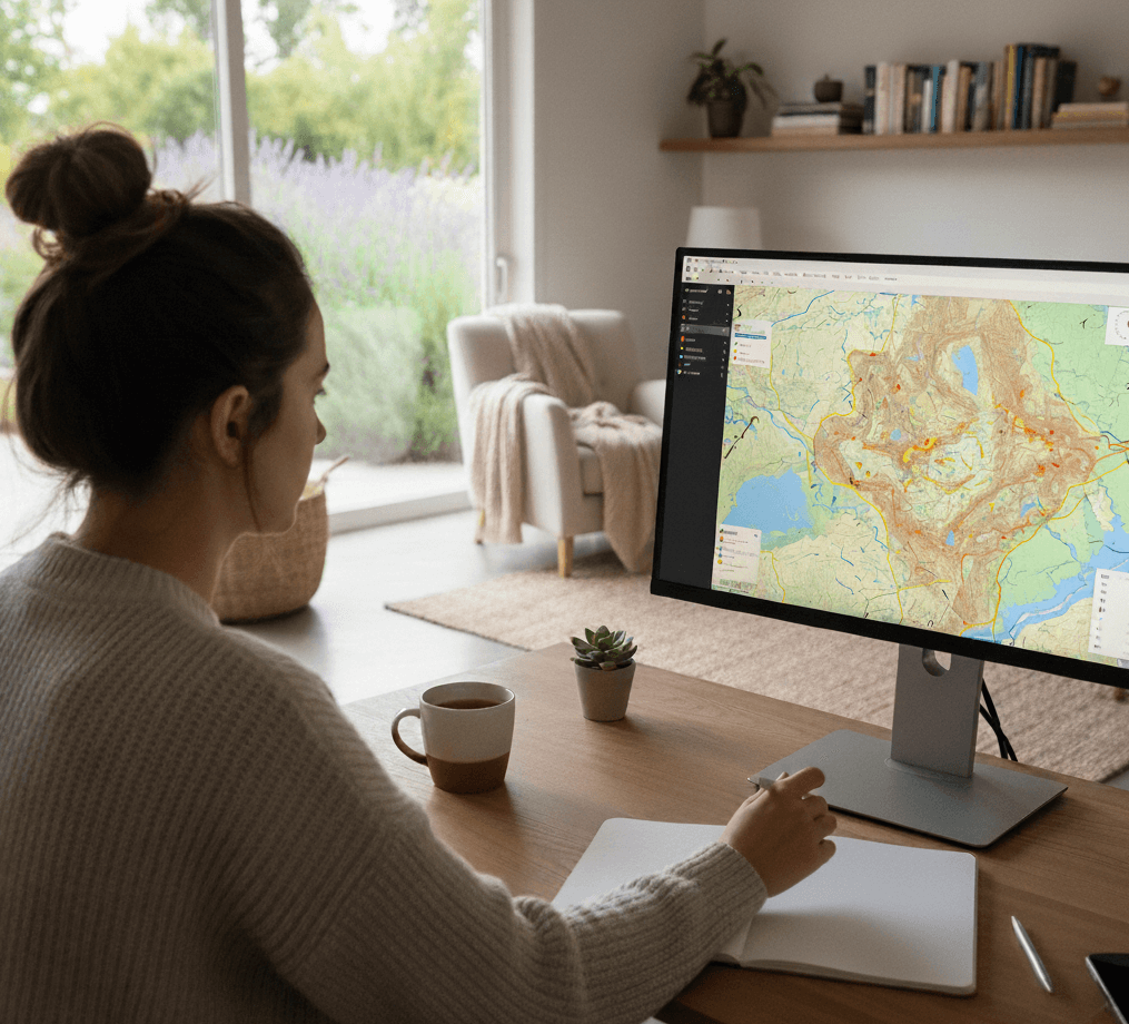
How to Read a Wildfire Map
Wildfire maps are useful tools, but only when read with the right expectations. They are built from multiple data layers that update on different schedules, including verified reports and automated satellite detections that can lag or require confirmation. Fires don’t behave neatly—perimeters can trail fast-moving flames, smoke can arrive before fire appears on a map, and conditions can change quickly. The safest approach is to consider multiple signals together, check timestamps, and use wildfire maps to support early preparation and evacuation—not to wait for certainty.
Fire Perimeters vs. Heat Detections
Fire perimeters outline the known or estimated boundary of a wildfire using verified information from incident teams, aerial mapping, and infrared surveys. They are generally the most reliable indicator of where a fire is actively burning, but they can lag behind fast-moving fires.
Heat detections are automated satellite signals showing unusually hot areas. They can indicate fire activity, but they may also reflect controlled burns or other heat sources. Treat heat detections as early warnings, not confirmation—especially when they:
- Appear repeatedly over time
- Cluster together
- Show up upwind of your location
Live Satellite Fire Maps
“Live” satellite fire maps are not truly real time. Satellites typically pass over the same area only a few times per day, which means there can be long gaps between updates. During wind-driven events, a fire can spread significantly between satellite passes. Because of this, satellite fire maps are best for understanding regional activity and trends—not for deciding whether it’s safe to stay or go.
Cameras, Infrared Flights & Update Cadence
Some wildfire maps include camera feeds or infrared flight data, which can add useful detail but have important limits:
- Cameras are affected by terrain, smoke, distance, and visibility
- Infrared flights provide detailed fire edges but occur intermittently
- Data can become outdated quickly during fast-changing conditions
Cameras and infrared flights add valuable detail to wildfire maps, but they have important limitations. Camera feeds can confirm smoke or flames, yet they are affected by distance, terrain, visibility, and heavy smoke, which can hide nearby fire activity. Infrared flights provide highly detailed views of fire edges and heat intensity, even through smoke, but they are conducted intermittently and can become outdated quickly. Always check timestamps and legends so you know how recently each layer was updated.
Putting It All Together
Wildfire maps work best when you treat them as a set of signals rather than a single source of truth. Fire perimeters help confirm incidents, heat detections provide early warning, satellite layers show broader trends, and cameras or infrared add detail when available. When multiple indicators align—especially alongside smoke, weather changes, or official alerts—it’s a strong signal to prepare or evacuate. If what you see on the ground or hear from authorities conflicts with a map, always trust official guidance and act early.
Accuracy Limits & Blind Spots You Need to Understand
Even the best wildfire maps have limitations. Recognizing these blind spots is a core part of wildfire safety.
Satellite lag is one of the biggest issues. Fires don’t wait for orbital schedules. A fire can grow dramatically between updates, especially during wind-driven events.
Cloud cover and heavy smoke can obscure satellite readings. Dense forests, steep terrain, and remote locations also reduce detection accuracy. Rural areas often have fewer sensors and slower reporting.
Most importantly, the absence of data does not equal the absence of risk. If you see smoke, smell burning, or hear evacuation warnings, trust those signals over a quiet or inactive map.
.png)
Pairing a Wildfire Map with Smoke & Air Quality Data
Wildfire maps show where fires are burning, but smoke and air quality data often reveal impacts sooner. Smoke can travel far ahead of flames, meaning deteriorating air quality may be the first sign that conditions are changing. Rising particulate levels, reduced visibility, or smoke odors can indicate nearby or upwind fire activity even when maps appear unchanged. When smoke trends align with active fires and worsening weather, it’s a strong signal to prepare, monitor alerts closely, and be ready to act—rather than waiting for fire perimeters to move closer.
Using Wildfire Risk Maps for Context (Not Prediction)
Wildfire risk maps are designed to show long-term vulnerability, not current fire conditions. They combine factors like vegetation, climate patterns, terrain, historical fire behavior, building density, and access routes to estimate how likely an area is to experience severe wildfire impacts over time. These maps are useful for understanding baseline exposure and for making informed decisions about home hardening, defensible space, insurance planning, and long-term mitigation—but they cannot tell you when or where the next fire will start.
Because of that, wildfire risk maps should never be used to guide evacuation timing. A low-risk score does not mean an area is safe during an active fire, and a high-risk score does not mean a fire is imminent. Instead, risk maps work best as context: they help explain why certain areas burn more often or more intensely and why early action matters. During a wildfire, always rely on real-time fire conditions, smoke, weather, and official alerts rather than risk scores alone.
World Wildfire Map, US Wildfire Map & Live Satellite Fire Map
People often search for wildfire information using different phrases—such as “world wildfire map,” “US wildfire map,” or “live satellite fire map”—and those terms are frequently used interchangeably online. In practice, they refer to different categories of tools, each designed for a specific level of awareness rather than direct decision-making.
- World wildfire maps show global trends and smoke transport but lack local precision.
- U.S. wildfire maps provide national context and verified incident data.
- Live satellite fire maps offer early signals but require confirmation.
These map types help explain what is happening at different scales—but none should be used alone to judge personal safety or delay action.
When to Act: Turning Map Awareness into Real-World Decisions
Wildfire maps are most valuable when they help you act earlier, not when they encourage waiting for perfect information. Use them to understand trends—nearby activity, worsening smoke, and shifting conditions—so you can move from monitoring to preparation before risk becomes urgent. If fires are moving closer or alerts begin increasing, that’s the time to review routes, stage go-bags, and get ready to leave.
Maps should never be used to second-guess evacuation warnings or delay departure. Fire behavior can change faster than any map updates, and waiting for a perimeter to “catch up” can cost critical time. The safest approach is to treat wildfire maps as early warning tools and follow official guidance immediately when evacuation orders are issued.
Last-Resort Safety: Where a FORT™ Fits in a Layered Plan
Wildfire maps exist to help people act early—by preparing and evacuating before conditions become life-threatening. Evacuation is always the safest option and should be prioritized whenever possible.
In extremely rare situations where all evacuation routes are cut off and escape is no longer possible, a purpose-built, tested refuge like FORT™ may provide temporary protection. A FORT™ is not a solution for staying behind, delaying evacuation, or riding out a fire—it is an absolute last resort when every other option has failed. Learn how to use it responsibly: How to Use FORT™ and Testing & Safety.
Frequently Asked Questions
What is the best wildfire map to use?
There is no single best wildfire map. Using multiple maps together provides the clearest understanding of conditions.
What is the best website for wildfire information?
Federal wildfire hubs, supported by public alert apps and local emergency notifications, offer the most reliable information.
How do I see wildfires on Google Maps?
Google Maps may show wildfire boundaries in some areas, but coverage and timing vary. It should not be relied on during active fire events.
Why do wildfire maps sometimes show nothing when I see smoke?
Smoke can travel far ahead of a fire, and satellite data can lag or be obscured. Visible smoke should always prompt preparation.
How often do wildfire maps update?
Update frequency varies by source. Always check timestamps and rely on official alerts.
Key Takeaways
- No single wildfire map provides a complete or real-time picture; using multiple maps together gives the clearest understanding.
- Verified fire perimeters are more reliable than satellite heat detections.
- All wildfire maps have blind spots, and quiet (inactive) maps can create false reassurance.
- Smoke and worsening air quality often appear before flames.
- Maps should support early action, not delay it.
- Evacuation comes first. FORT™ is a last resort only.
Conclusion
Wildfire maps are most effective when they help people act sooner, not wait longer. No single map provides a complete or real-time picture, which is why stacking multiple sources, checking timestamps, and pairing fire data with smoke, risk, weather, and official alerts is essential. Maps should support preparation and early evacuation decisions, never delay them—especially as conditions begin to change. Long before fire season peaks, clear evacuation plans, go-bags, defensible space, and practiced routes reduce the pressure to interpret maps under stress. In extremely rare situations when evacuation is impossible, a purpose-built refuge like FORT™ may provide temporary protection—but evacuation always comes first, and FORT™ is strictly a last resort.